
“The Sisterhood of the Traveling Pants was actually my first hardcover,” Marci Senders said about designing the cover for the best-selling young adult novel by Ann Brashares. “For the design, I went with something really simple and obvious—and then gave it a twist.”
Marci Senders (BFA ’00) is a children’s book designer and illustrator with over 25 years of experience in the field. For Senders, choosing Tyler was easy. Having grown up in central New Jersey, she was familiar with Philadelphia.
"I remember taking private art classes from when I was at least eight years old. It was only natural for me to go to art school,” she said. “Tyler was the perfect distance from home and was a really good school for me.”
As a student, Senders studied graphic design and illustration. She enjoyed incorporating hand-drawn elements into her work, specifically for typography and logo design.
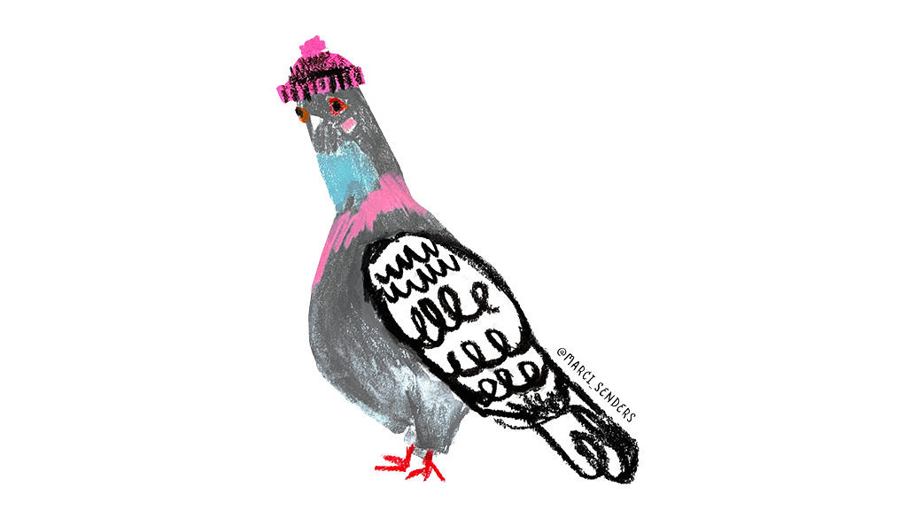
An illustration of a pigeon by Marci Senders. Photo provided by the artist.
Tyler’s program allowed her to develop a suite of skills that would carry her throughout her academic and professional career. More importantly, she was able to develop a signature style that follows her to this day.
“I really liked that I was able to put my hand into every project,” she said. “I was into making it look crafty and my professors embraced that.”
After graduating, Senders used her education to break into children’s book publishing. With the burst of dot-com bubble looming, it was a move that was informed as much by curiosity as instinct.
“I graduated right before the bubble burst,” she said. “I always thought I would get into books, but it could have gone differently. At the time, a lot of the students I graduated with were doing design projects for start-up websites. I’m glad I ended up in print.”
Senders’ first job was with a book packaging company, Alloy Entertainment, that partnered with publishing giants like Penguin Random House, HarperCollins and Simon & Schuster to design covers for upcoming serials. Through this role, Senders was able to break into the industry and started designing books that would define the “coming of age” genre—like The Sisterhood of the Traveling Pants, which is celebrating its 25th anniversary this year.
“Originally, I pitched a hot-pink neon background for the cover, but they wanted green,” she said. “At the time, there was a myth that book covers shouldn’t be green. Like, they didn’t sell well. Then there was a book called The Perks of Being a Wallflower that was green, and it did really well.”
“It was the editor at Random House, that was like, ‘Let's go green 'cause then we're, like, being rebels.’ And so, we went with green,” she continued.

A photo of the 2004 hardcover edition of "The Sisterhood of the Traveling Pants". Photo courtesy of the artist.
Blending her signature craft style with the trendy green hue of the time, Senders’ design of the 2004 hardcover edition of The Sisterhood of the Traveling Pants became an instant classic, emphasizing the book’s central motif of “traveling pants” while adding a creative, yet hidden edge.
“There's the pants on the cover, but the twist is that we added the character’s names across it,” she said. “So, you have that secondary element. Every book was a little different. For the first book, we just had the characters’ names.”
As Senders and her team planned designs for the Sisterhood series, they experimented with drawing type on a pair of jeans by hand to then feature on the cover. The original typography was eventually recreated digitally for better visual clarity with the hand-drawn elements; the process was reminiscent of Senders’ early work as a student at Tyler—combining hand-drawn elements with illustration and craft.
“I embroidered the pockets of the pants,” she said. “Even though it’s super, super tiny, that’s an actual embroidered pocket. I don’t think they used my embroidery for the movie, but they featured the design in the beginning of one of the movies.”
In 2010, Senders started working at Disney as an art director where she led the creative process for the popular young adult titles like The Isle of the Lost by Melissa de la Cruz which is the first in a five-book series.

Pictured above: The cover design for "The Isle of the Lost" by Melissa de la Cruz. Photo courtesy of the artist.
“I worked on a lot of Melissa de la Cruz books. At the time, Disney was really big on serial projects—and they still are,” she said.
Senders’ signature use of typography, color theory and composition inspired the visuals for other Disney titles including The Queen’s Council series, the graphic novels in Liz Braswell’s A Twisted Tale series, Lore by Alexandra Bracken and the Meant to Be series. Her role involved working across teams, coordinating with authors and identifying key elements to incorporate into their book designs—skills she continues to utilize in her current role as a freelancer.
Through freelancing, Senders works directly with authors across multiple genres, helping them cultivate visual assets that resonate with readers. The role enables her to be more creative and flexible in her practice, while also allowing her time to develop her own stories. Her illustrations have also appeared in issues of American Illustration.

Pictured above: Cover designs for "Butternut" (in a series of imagined book covers) and an Andy Warhol biography, inspired by Charles Schulz. Both designs were featured in American Illustration.
“I'm really taking advantage of this time to finally write my own stories,” she said. “I’m attending an artist’s residency at Chateau D’orquevaux. It’s three weeks in this beautiful French castle with about 30 other artists, writers and musicians. I want to use this experience to write a picture book about cats that live in a castle.”
Senders’ word of advice to Tyler students? Make the work that you love.
“Create a portfolio of work that you really love,” she said. “That's my biggest piece of portfolio and career advice.”