Drova Artisanal Vodka, Senior
Alexander G. Kalatschinow
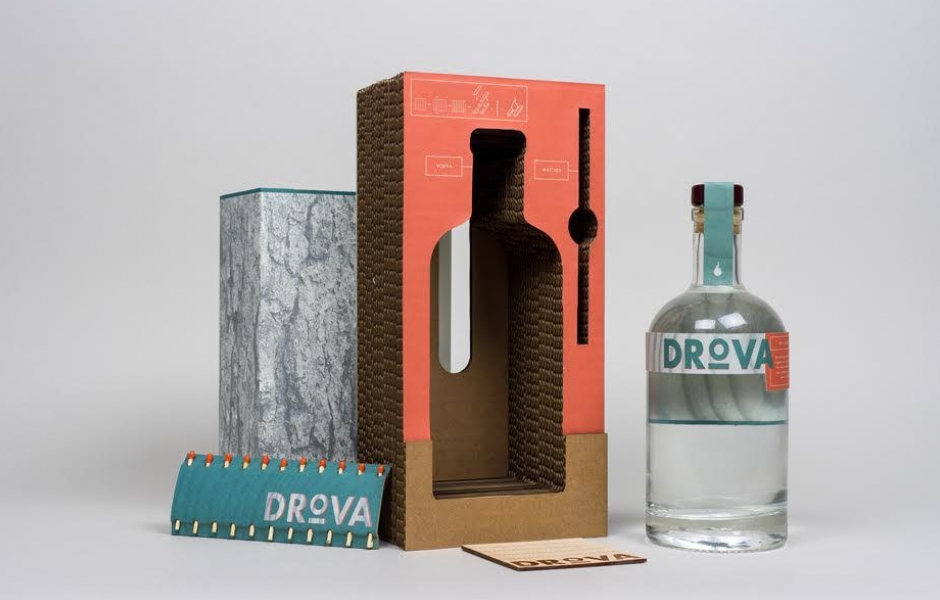
Drova artisanal vodka is an upscale liquor packaging with utility and aesthetic in mind. Inspired by my Mother’s heritage, the name Drova comes from the Russian word for firewood playing on the “firewater” moniker of the liquor itself. The carrier is created to embody the purpose and visual iconography of firewood while utilizing recycled cardboard material that is functional, cost effective, and also a survival kit. The included branded matches and wooden coaster become the tinder for the fire and the start for your next get away to the great outdoors. Instructor: Paul Sherrif
Burning Man 2016, Senior
Alexander G. Kalatschinow
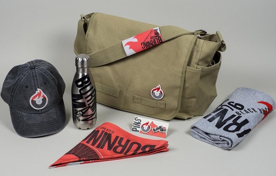
In this assignment I was tasked to create a rebrand of The Burning Man music festival. I wasninspired by the beautifully arid background of the location and the energetic vitality of the gathering and I created the color palette of this identity to convey that. The main mark is graphic interpretation of the festival setup while incorporating the titular element of fire. The typography is made to replicate the From the baseball cap, messenger bag, and bandana/ schedule poster everything was created with utility in mind. I screen printed the t shirt and built a pin set to offer an artistic outlet to fully submerge the attending audience in the Burning Man experience. Instructor: Paul Sherrif
Char Le Tunn's Celebrated and Revered
Alexander G. Kalatschinow
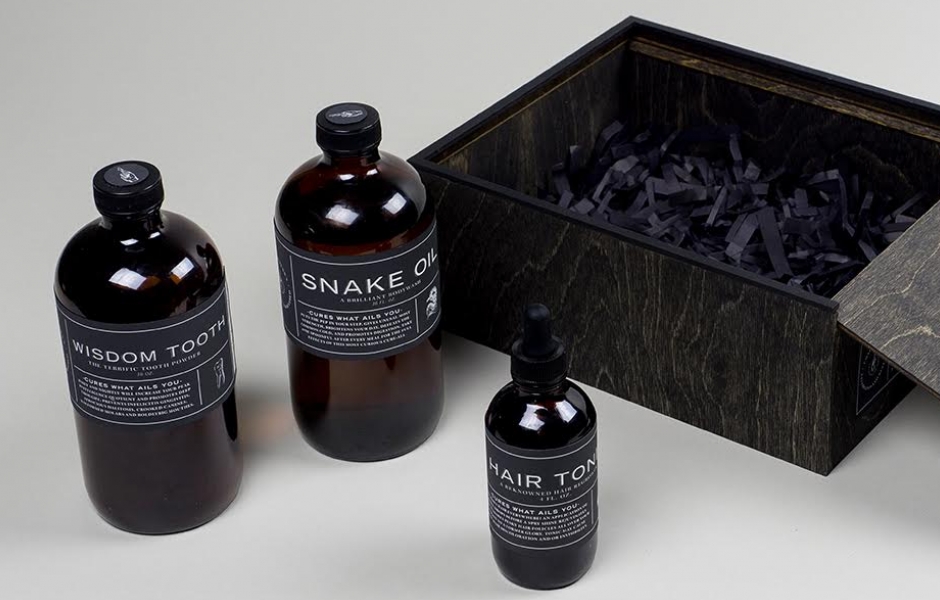
For this assignment we were tasked on creating a soap and hygiene set from the phrase“immaculate redemption.” From that jumping off point I was drawn to the era of charletton salesmen and patent medicines creating Char Le Tunn’s Celebrated and Revered brand. I drew my inspiration from typography from period Victorian theatrical posters and publication in a more contemporary context. I created these products to be snake oil soap, wisdom tooth powder, and hair tonic all created to provide the cure-all to your next infirmity. Instructor: Paul Sherrif
Burning Man Rebrand, Senior
Emily McElwain-Siems
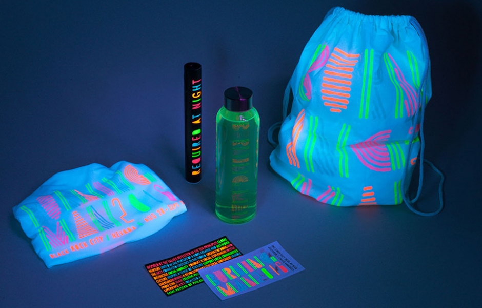
This is a rebrand of the Burning Man Festival in Black Rock City, Nevada. My direction for the rebrand was inspired by the visuals of burning man at night. The bright neon lights, art exhibitions, and fire found at the Burning Man Festival gave it a bright feel during the day, but an even more vibrant feel at night. I chose to translate this visual to my brand using UV lights and UV reactive ink. Instructor: Paul Sherrif
Buzz'd, Senior
Emily McElwain-Siems
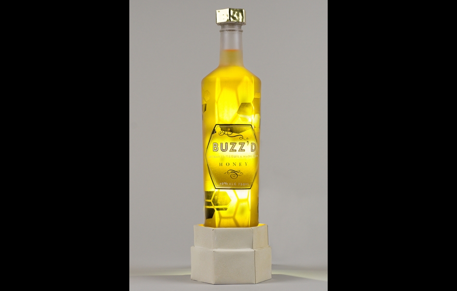
Buzz’d is an artisanal tequila made from honey. The concept of the bottle came from the glow of honey bee hives. The bottle was sandblasted to reflect the pattern of honeycombs and a light was placed in the base of the carrier to create the glow that is naturally reflected through the hexagon shapes in the honeycomb. Instructor: Paul Sherrif
Staple, Senior
Emily McElwain-Siems
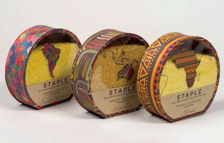
Staple is a food brand that delivers staple food items to your table from all around the world. Each country has their own staple foods, creating a wide assortment of pantry items with different flavors. Staple’s couscous is the most popular item, coming from Africa, Europe, and South America. The box patterns are inspired by cultures in each country or continent. Instructor: Paul Sherrif
Packaging
Packaging
-
Share:
- Email Info